Cryptocurrencies
Using Unsupervised Machine Learning to Discover Unknown Patterns

Background
Overview of Analysis
This project consists of four technical analysis deliverables.
-
Deliverable 1: Preprocessing the Data for PCA
-
Deliverable 2: Reducing Data Dimensions Using PCA
-
Deliverable 3: Clustering Cryptocurrencies Using K-means
-
Deliverable 4: Visualizing Cryptocurrencies Results
Purpose
Stakeholders are interested in offering a new cryptocurrency investment portfolio for its customers. The company, however, is lost in the vast universe of cryptocurrencies. We’ll create a report that includes what cryptocurrencies are on the trading market and how they could be grouped to create a classification system for this new investment.
The data we will be working with is not ideal, so it will need to be processed to fit the machine learning models. Since there is no known output for what we are looking for, we will use unsupervised learning. To group the cryptocurrencies, we decided on a clustering algorithm. We’ll use data visualizations to share our findings.
Resources
Data source:
- (1) crypto_clustering_starter_code, (2) cryptocurrency data (crypto_data.csv)
Software:
- Python 3.9.10, Jupyter Lab 4.6, Visual Studio Code 1.71.2
Methodology
D1: Preprocessing the Data for PCA
Using Pandas, we’ll preprocess the dataset in order to perform PCA in Deliverable 2.
D2: Reducing Data Dimensions Using PCA
Using the Principal Component Analysis (PCA) algorithm, we’ll reduce the dimensions of the X DataFrame to three principal components and place these dimensions in a new DataFrame.
D3: Clustering Cryptocurrencies Using K-means
Using the K-means algorithm, we’ll create an elbow curve using hvPlot to find the best value for K from the pcs_df DataFrame created in Deliverable 2. Then, we’ll run the K-means algorithm to predict the K clusters for the cryptocurrencies’ data.
D4: Visualizing Cryptocurrencies Results
Using our knowledge of creating scatter plots with Plotly Express and hvplot, we’ll visualize the distinct groups that correspond to the three principal components you created in Deliverable 2, then we’ll create a table with all the currently tradable cryptocurrencies using the hvplot.table() function.
Results:
D1: Preprocessing the Data for PCA
The following five preprocessing steps have been performed on the crypto_df DataFrame:
-
All cryptocurrencies that are not being traded are removed
-
The IsTrading column is dropped
-
All the rows that have at least one null value are removed
-
All the rows that do not have coins being mined are removed
-
The CoinName column is dropped
-
A new DataFrame is created that stores all cryptocurrency names from the CoinName column and retains the index from the crypto_df DataFrame
-
The get_dummies() method is used to create variables for the text features, which are then stored in a new DataFrame, X
-
The features from the X DataFrame have been standardized using the StandardScaler fit_transform() function
The final DataFrame is shown below, Figure 1.1
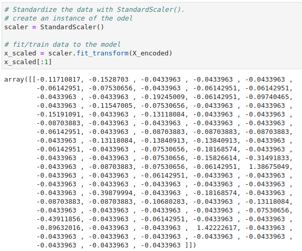
Figure (1.1) X_scaled DataFrame: X DataFrame have been standardized using the StandardScaler fit_transform() function.
D2: Reducing Data Dimensions Using PCA
- The pca algorithm reduces the dimensions of the X DataFrame down to three principal components
- The X_pca_df DataFrame is created and has the following three columns, PC 1, PC 2, and PC 3, and has the index from the crypto_df DataFrame
The final DataFrame is shown below, Figure 1.2
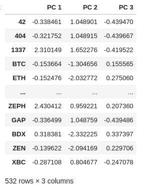
Figure (1.2) X_pca_df DataFrame
D3: Clustering Cryptocurrencies Using K-means
The K-means algorithm is used to cluster the cryptocurrencies using the PCA data, where the following steps have been completed:
- An elbow curve is created using hvPlot to find the best value for K

Figure (1.3) Elbow curve
- Predictions are made on the K clusters of the cryptocurrencies’ data

Figure (1.3) K-Means Algorithm: used to cluster the cryptocurrencies.
- A new DataFrame is created with the same index as the crypto_df DataFrame and has the following columns: Algorithm, ProofType, TotalCoinsMined, TotalCoinSupply, PC 1, PC 2, PC 3, CoinName, and Class.
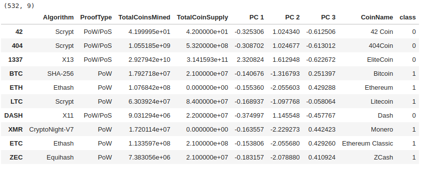
Figure (1.3) Clustered_df DataFrame.
D4: Visualizing Cryptocurrencies Results
- The clusters are plotted using a 3D scatter plot, and each data point shows the CoinName and Algorithm on hover

Figure (1.3) 3D Scatter plot

Figure (1.3) 3D Scatter plot with CoinName and Algorithm on hove
- A table with tradable cryptocurrencies is created using the hvplot.table() function
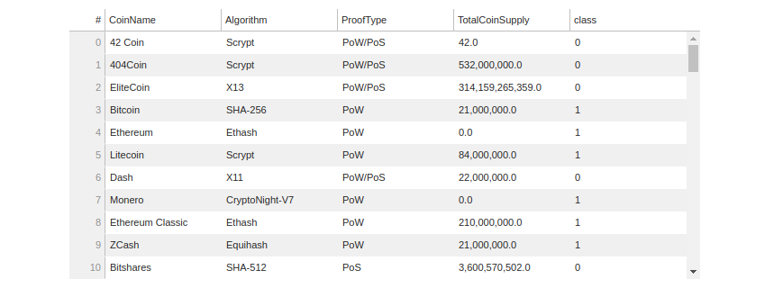
Figure (1.3) hvplot table
- The total number of tradable cryptocurrencies is printed

Figure (1.3) Total number of tradable cryptocurrencies
- A DataFrame is created that contains the clustered_df DataFrame index, the scaled data, and the CoinName and Class columns
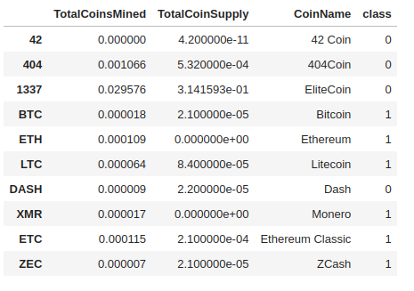
Figure (1.3) DataFrame that has the scaled data with the clustered_df DataFrame index.
- A hvplot scatter plot is created where the X-axis is “TotalCoinsMined”, the Y-axis is “TotalCoinSupply”, the data is ordered by “Class”, and it shows the CoinName when you hover over the data point
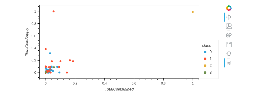
Figure (1.3) hvplot scatter plot
Summary
On this project, we worked primarily with the K-means algorithm, the main unsupervised algorithm that groups similar data into clusters. And build on this by speeding up the process using principal component analysis (PCA), which employs many different features to reduce the dimensions of the DataFrame.
Then using the K-means algorithm, we created an elbow curve using hvPlot to find the best value for K. Then, runned the K-means algorithm to predict the K clusters for the cryptocurrencies’ data.
Finally we created scatter plots with Plotly Express and hvplot, to visualize the distinct groups that correspond to the three principal components. Then created a table with all the currently tradable cryptocurrencies using the hvplot.table() function.
The ultimate goal for this visualizations is to present the data in a story that would be interactive, easy to understanding and that provide the correct information to help the stakeholders in the decision making process.